In the rapidly evolving digital landscape, having a responsive web design is no longer just an option but a necessity. As mobile devices continue to dominate internet usage, the way users interact with websites has fundamentally changed. This shift necessitates a web design approach that is flexible across all devices and screen sizes. In this post, we will delve into the benefits of responsive web design and its significant impact on Search Engine Optimization (SEO).
If you are interested in launching your personal or business website, Aventine Digital can take your vision to reality!
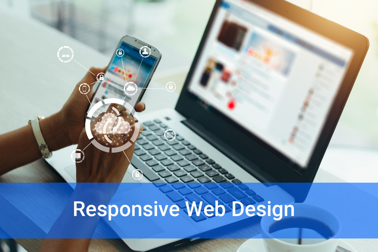
What is Responsive Web Design?
Responsive web design (RWD) refers to a design strategy that allows web pages to render well on a variety of devices and window or screen sizes. This approach provides an optimal viewing experience through flexible images, fluid grids, and media queries, allowing the page to adapt to the device, whether it’s a desktop, tablet, or smartphone.
Enhanced User Experience
One of the primary benefits of responsive web design is the enhanced user experience. A responsive website automatically adjusts itself to fit the device’s screen size, leading to improved readability and usability. This seamless adaptation reduces user frustration and bounce rates, as visitors are less likely to leave the site due to poor display or difficult navigation.
Improved Site Speed
Responsive design contributes to faster page loading times. Websites optimized for mobile devices load quicker than their non-responsive counterparts, which is crucial since page speed is a factor considered by Google’s algorithm for both desktop and mobile sites. Faster loading times improve user experience and positively affect your website’s search engine ranking.
Lower Bounce Rates
A responsive website keeps visitors engaged longer. If a site is easy to navigate and read, users are more likely to stay, reducing bounce rates. Google interprets lower bounce rates as a sign of a relevant and useful website, which enhances SEO rankings.
Higher Conversion Rates
A responsive design adapts to the user’s environment, leading to a consistent and positive experience. This consistency increases the likelihood of converting visitors into leads or customers, regardless of the device they are using. An optimized and consistent site, through responsive design, helps maintain customer trust and encourages conversions.
Avoiding Duplicate Content
Responsive design eliminates the need to create separate websites for mobile and desktop. This singular approach prevents issues related to duplicate content, which can negatively impact SEO. With a single responsive site, all content lives on one URL, making it easier for Google to crawl and index the content.
Google’s Preference for Responsive Design
Google explicitly recommends responsive web design as the best method to target mobile users and favors mobile-optimized sites when presenting results for searches made on a mobile device. This preference is pivotal because it directly influences how Google indexes and ranks sites. Google’s mobile-first indexing bases search rankings on the mobile version of a page, highlighting the importance of responsive design for SEO strategy.
Social Sharing Benefits
Responsive web design makes social sharing easier, helping to broaden a brand’s exposure and increase traffic to the site. Well-integrated social sharing buttons adapt to mobile devices, enhancing interaction and engagement. While social signals may not directly influence rank, the broader engagement can lead to more inbound links and further SEO benefits.
Conclusion
Responsive web design is integral to a robust online strategy, enhancing user experience, and boosting SEO performance. By embracing a responsive design, you not only cater to the immediate needs of the modern consumer but also future-proof your website against ongoing digital developments. Investing in responsive design is investing in your site’s relevance, which is key to maintaining an effective online presence in today’s competitive market.
If you are interested in launching your personal or business website, Aventine Digital can take your vision to reality!